Video transcript
A hundred years ago the British government worked with commercial advertising agencies to launch a poster-based recruiting campaign. Historians from the National Army Museum took some of these designs to modern brand communication company Small Back Room to compare the techniques used in the past with those used today.
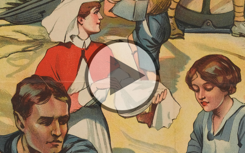
Rob Fleming: At the start of the First World War Britain had the largest navy in the world, but only a small professional army. The army that they had to face off against, the German Army, had over a million men. By comparison the British Army was only a quarter of a million, so the needs of the war meant that we needed to recruit large numbers of men in a very short space of time. To do this a recruiting campaign was launched and it relied largely on posters and graphic art to do that. In the poster “Are YOU in this?”, the appeal is quite obvious. At the top we see the soldiers and sailors at the front line protecting Britain and protecting the Union Flag. But in the foreground we see munitions workers and factory workers also contributing to the war effort. And the appeal is even broader. We see the boy scout who’s able to contribute by delivering messages as a courier. So all aspects, all elements of society are called upon to contribute to the war effort.
David Bownes: This poster was designed by Sir Robert Baden-Powell who was a hero from a previous British war, and founder of the Boy Scouts movement, which is why you’ve got a scout right in the centre of the image. People looking at this poster in 1915 would’ve seen a very familiar advertising image from the time. Baden-Powell uses a bold image with a short pithy sentence: Are you in this? “You” is capitalised and underlined for emphasis and the idea is that everyone is in the war effort together; except that is for the young chap in civilian clothes who would have been described as a ‘slacker’ at the time, shirking his patriotic responsibilities, and not taking part in the war effort for the greater good.
Farhan Urfi: What’s really interesting about this poster are the similarities it shares with modern day recruitment campaigns, particularly for the armed forces. What it’s doing is really addressing lots of different people from lots of different backgrounds with lots of different skill sets, right the way up from the manual workers all the way up to the pinnacle, right at the top where the Union Flag is. And interestingly, the shape of the whole structure is a pinnacle, it’s a triangle, it’s all leading towards the top where the focus is ultimately going to be.
 First World War in Focus


